MUI for Figma
A large UI kit with over 600 handcrafted MUI symbols for Figma.
Includes
- 600+ high-quality symbols - ready to use and customize - kept up-to-date with the React components (MUI Core and MUI X)
- 1,000+ icons grouped and named consistently with Material Design in 5 themes
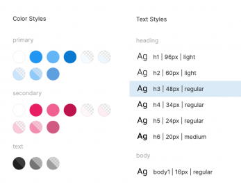
- 100+ customizable color, typography, and elevation styles
- 50+ frames with component and style guide documentation
- 1 year of updates
- Figma variants
- Auto Layout
No matter what your role, you'll be more efficient
UI / UX Designers
Save time using this large library of UI components, icons, and styles to deliver your work faster. You can customize the kit however you want to match your product's brand.
Product managers / Entrepreneurs
Create MVPs efficiently and save hundreds of hours on UI Design. This is a great place to start if your product or brand needs a design system. Equip your team with this library for Figma and build consistent products faster.
Developers
Gain autonomy, design a beautiful, consistent, and accessible interface without relying on designers. You can preview how it will look before coding it.
The UI kit was created specifically for MUI, a popular React UI library with a comprehensive set of components. MUI has over 2M+ active users and 70k+ stars on GitHub!
See it in action
You can copy the community version of Material UI to play with some of the components, screens, layouts, and styles available in this UI kit. You can also preview the full version of Material UI and Joy UI.
See the overview of the latest release v5.11.0:
Features
A comprehensive component inventory for Figma
The UI kit contains all the MUI components with states and variations which gives 1,500+ unique elements. All components are designed with the most up-to-date release.
The elements use Auto Layout which makes them scalable and adjustable. Convenient naming optimized for Figma allows you to quickly find and use the desired component.

Apply your product branding in minutes
The whole Material Design theme is ready to use and customize. The styles depend on shared variables which makes them easily customizable and consistent. The kit includes the whole Material Design color palette. Change font and color styles to match your product branding in minutes.
Everything is documented for developers so you don't need to worry about creating all states and docs yourself.

Save hundreds of hours
The UI kit was built for MUI and optimized for Figma. Save hundreds of hours and use the MUI React library to bring your products to life.
A large icon library ℹ️
1,000+ material icons in 5 themes (filled, outlined, rounded, sharp, and two-tone), grouped and named accordingly. You can reuse icons throughout the whole UI Kit in components because everything is connected together.
![]()
Built exclusively for Figma
The kit takes full advantage of the features of Figma.
Handcrafted to perfectly match MUI ✨
Avoid surprises. What you design is what you get in production, with high reliability and consistency.
Details
- The item is brought to life by Devias IO.
- You can find our public roadmap of what will come next.
- Don't hesitate to open new issues if you noticed improvement opportunities.
FAQ
What long-term support do you offer?
The license is perpetual – once the kit is downloaded, it can be used forever. It's a one-time payment with no automatic annual subscription. To extend the support and get access to the newest versions for a further 12 months, you need to make a new purchase. We offer a 50% discount for licenses renewed during the support entitlement. We also offer a 25% discount for licenses renewed after the support expired.
How many licenses do I need?
The number of licenses purchased must correspond to the maximum number of editors working concurrently in a 24-hour period. An editor is somebody contributing changes to the designed screens that use the UI kits. No licenses are required for viewing the designs.
How do I install the kit?
The first step is to extract the archive. This should give you a couple of .fig files. Then, you can follow the Figma help center article to either import it, or add it to your team library.
The UI kit got an update. How do I get it?
We'll send you an email when a new release is available.
You can access the item on the download page of your store account. You can find a detailed description of the changes under the "Changelog" tab on this page.
I got the latest update of the kit. What should I do with it?
Figma or Sketch or Adobe XD?
We aim to keep feature parity between the Figma, Sketch, and Adobe XD kits where possible.
We offer a 50% off coupon for past customers who want to switch between two design tools.
Do you offer discounts to educational or non-profit organizations?
Yes, we offer a 50% discount on all products licensed to students, instructors, non-profit, and charity entities. This special discount cannot be combined with any other type of discount.
To qualify for the discount, you need to send us a document clearly indicating that you are a member of the respective institution. An email from your official account which bears your signature is sufficient in most cases.
For more information on how to qualify for this discount, please contact sales.
Number of licenses
Live previewKept up to date with the React components e.g. Text field
1 year of updates
Generous customer refund policy
| Version | 5.11.0 |
| Latest release | Jan 5, 2023 |
| First release | May 18, 2020 |
| Category | Design |
| Questions? | Contact us |
 Created byMUI | |
